The Complete Shopify Polaris Components Guide 2026
Build native-looking Shopify admin interfaces with Polaris components — setup, layout, forms, data display, and design token customisation.
Shopify Polaris components are the official React UI library for building Shopify admin interfaces. Using Shopify Polaris components ensures your app looks and behaves exactly like the native Shopify admin — consistent typography, spacing, colour tokens, and interaction patterns. Polaris v12, the current release, introduces CSS custom properties for all design tokens, making theming and overrides cleaner than any previous version.
Every app embedded in the Shopify admin should be built with Shopify Polaris components. Not only does it give merchants a familiar, trustworthy UI — it significantly reduces build time because layout, form validation, data display, and error handling are all provided out of the box. This guide covers installation, the core component categories, and the design token system introduced in Shopify Polaris components v12.
Shopify Polaris Components: Installation and AppProvider
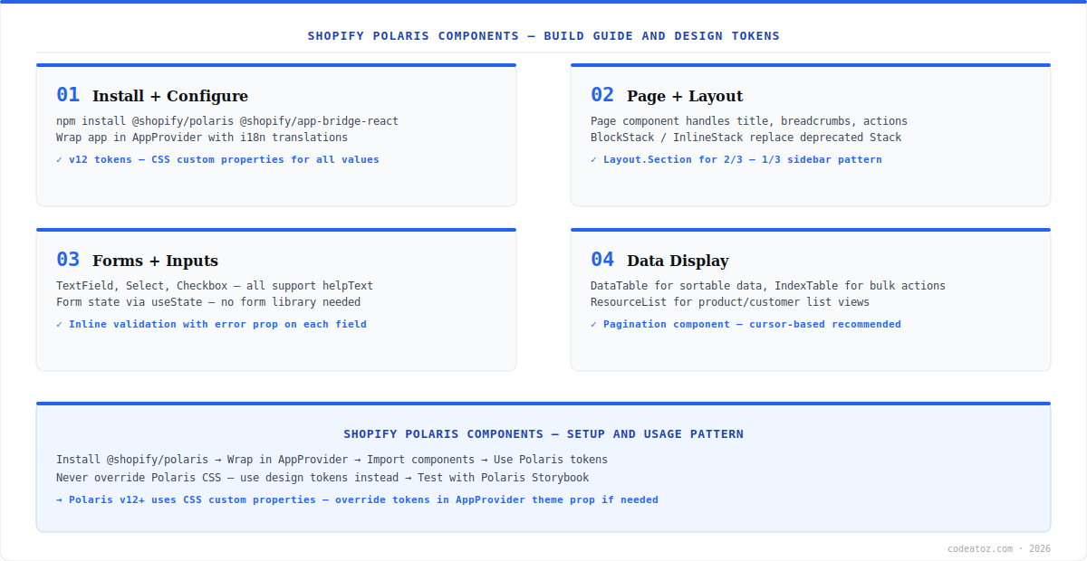
Install Shopify Polaris components alongside App Bridge React — they are designed to work together. The AppProvider must wrap your entire app and requires an i18n translations object. Import @shopify/polaris/build/esm/styles.css at the root of your app. Refer to the Polaris component documentation for the full component catalogue.
npm install @shopify/polaris @shopify/app-bridge-react
import {AppProvider} from '@shopify/polaris';
import enTranslations from '@shopify/polaris/locales/en.json';
import '@shopify/polaris/build/esm/styles.css';
export default function App() {
  return (
    <AppProvider i18n={enTranslations}>
      <YourAppContent />
    </AppProvider>
  );
}Shopify Polaris Components: Page Layout and Navigation
The Page component is the top-level shell for every admin page in Shopify Polaris components. It handles the page title, breadcrumbs, subtitle, and primary/secondary action buttons. Inside it, use Layout with Layout.Section for 2/3 + 1/3 column layouts, or BlockStack and InlineStack for flexible spacing. The legacy Stack and TextContainer components are removed in v12 — always use the newer primitives. Check the App Bridge documentation for how navigation integrates with Shopify Admin routing.
import {Page, Layout, Card, BlockStack, Text} from '@shopify/polaris';
function ProductPage() {
  return (
    <Page
      title="Products"
      primaryAction={{content: 'Add product', onAction: handleAdd}}>
      <Layout>
        <Layout.Section>
          <Card><BlockStack gap="400">
            <Text as="h2" variant="headingMd">Main content</Text>
          </BlockStack></Card>
        </Layout.Section>
        <Layout.Section variant="oneThird">
          <Card>Sidebar</Card>
        </Layout.Section>
      </Layout>
    </Page>
  );
}Shopify Polaris Components: Forms and Data Display
Shopify Polaris components provides a complete set of form inputs — TextField, Select, Checkbox, RadioButton, DropZone for file uploads, and Combobox for autocomplete. Each supports error, helpText, and label props for inline validation. For data display, DataTable handles sortable tabular data, IndexTable is the standard for product/customer list views with bulk actions, and ResourceList renders card-style lists. All data display components are designed to work with Shopify’s cursor-based pagination pattern. Explore all 200+ components interactively at the Polaris component Storybook. Our Shopify development team builds admin apps exclusively with Shopify Polaris components for App Store compliance. See our Shopify app extensions guide for how Polaris is used inside Admin UI Extensions.
Shopify Polaris components v12 exposes all design values as CSS custom properties — --p-color-bg-surface, --p-font-size-300, --p-space-400 etc. Override them in the AppProvider theme prop or target .Polaris-Box in CSS. Never hardcode hex colours or pixel values — always reference a Polaris token. This keeps your app automatically compatible with any future Polaris theme changes.
Frequently Asked Questions About Shopify Polaris Components
What are Shopify Polaris components?
Shopify Polaris components are Shopify’s official React UI library for building Shopify admin interfaces. They provide 200+ pre-built components covering layout, navigation, forms, data display, feedback, and overlays. Apps built with Polaris match the native Shopify admin look and feel, reducing merchant learning curve and improving trust.
How do I install Shopify Polaris components?
Install Shopify Polaris components with npm install @shopify/polaris. Wrap your app in AppProvider with the i18n translations object and import the Polaris CSS file at your app root. Polaris v12 requires React 18+. Use @shopify/app-bridge-react alongside Polaris for apps embedded in the Shopify admin via App Bridge.
What is AppProvider in Shopify Polaris components?
AppProvider is the root context provider required by all Shopify Polaris components. It provides internationalisation (i18n), theme context, and feature flags to all child components. Every Shopify Polaris app must wrap its component tree in AppProvider. Without it, Polaris components will not render correctly and will throw context errors.
How do I customise themes in Shopify Polaris components?
Customise Shopify Polaris components v12 themes by passing a theme object to the AppProvider theme prop. The theme object maps Polaris token names to custom values. Alternatively, override CSS custom properties like –p-color-bg-surface in your CSS. Never override Polaris component CSS classes directly — use the token system for forward compatibility.
What replaced Stack in Shopify Polaris components v12?
Stack was removed in Shopify Polaris components v12. Use BlockStack for vertical spacing (replaces Stack vertical) and InlineStack for horizontal spacing (replaces Stack horizontal). Both accept a gap prop using Polaris spacing tokens (100-1600). The migration guide at polaris.shopify.com covers all breaking changes between Polaris versions.
Which Shopify Polaris components should I use for data tables?
For tabular data in Shopify Polaris components, use DataTable for simple read-only tables with optional sorting. Use IndexTable for list views that need row selection, bulk actions, and filtering — this is the standard pattern for products, orders, and customers in Shopify admin apps. ResourceList is used for card-style lists where each item needs custom layout.
Building a Shopify Admin App with Polaris?
Our team builds App Store-ready Shopify admin apps with full Polaris component architecture, App Bridge, and GraphQL.