How We Build Custom Components in Hyvä Using Alpine.js and Tailwind CSS
Real component code from production Hyvä stores — gallery, accordion, cart button, sticky header, and event dispatch.
Building Hyvä custom components is the part of Hyvä development that clicks everything into place. Once you understand how Alpine.js and Tailwind CSS work together, you can build any Hyvä custom component fast, clean, and with far less code than the KnockoutJS equivalent would have required.
Every Hyvä custom component in this guide is real code from production stores. No toy examples. The patterns here are what we actually ship.
Alpine.js in Hyvä — Core Concepts for Custom Components
Every Hyvä custom component uses Alpine.js — Hyvä replaces Magento’s KnockoutJS and RequireJS entirely with this lightweight reactive framework (about 15KB). You write Hyvä custom components directly in HTML attributes with no separate JS files needed.
The key Alpine directives you’ll use constantly:
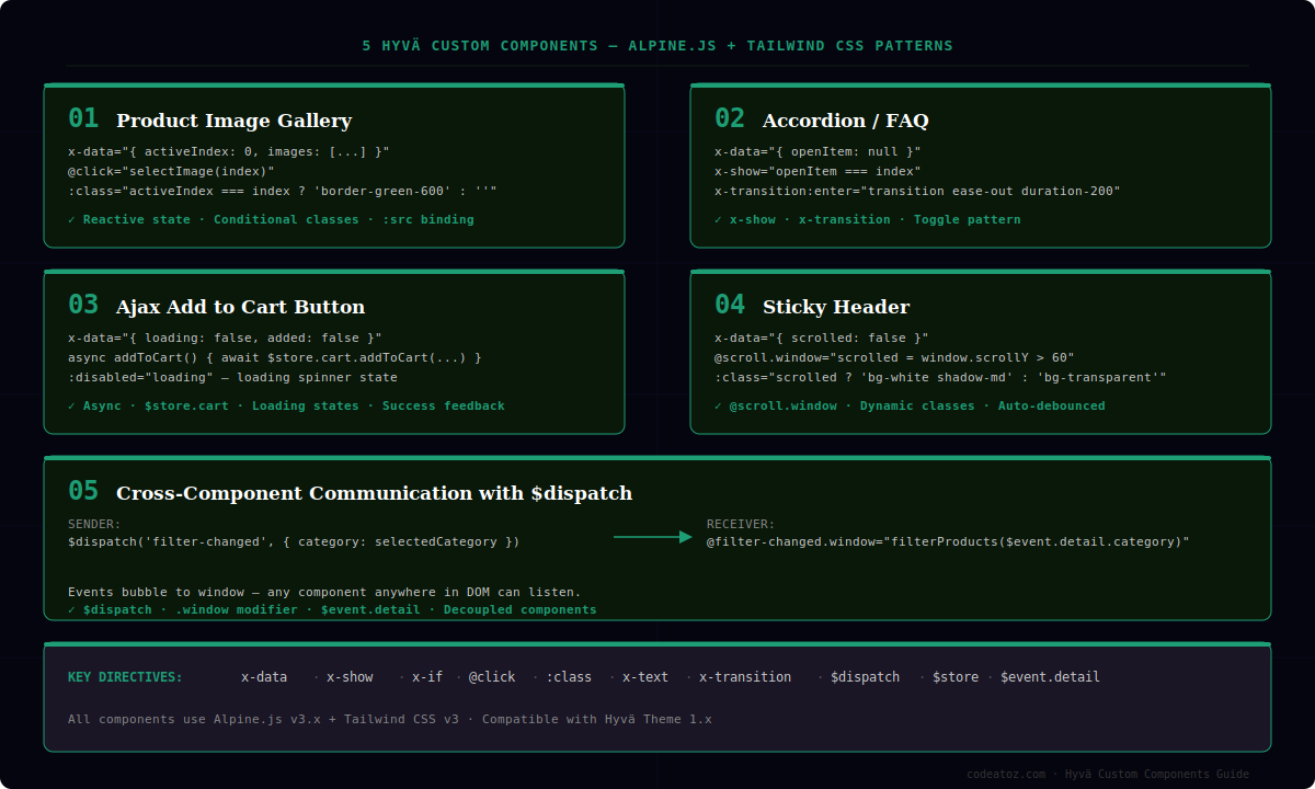
x-data— defines a component’s reactive data scopex-show/x-if— conditionally show or render elements@click/@keydown— event listeners:class/:style— dynamic bindingsx-text/x-html— output data into elementsx-transition— CSS transition helpers$dispatch— fire custom events to other components$store— access global Alpine stores (Hyvä uses these extensively)
Component 1 — Product Image Gallery
Thumbnail switcher with active state
A common product page requirement — clicking a thumbnail updates the main image with an active border on the selected thumb.
<!-- In your product/view/media.phtml -->
<div x-data="{
    activeIndex: 0,
    images: = /* @noEscape */ $block->getGalleryImagesJson() ?>,
    selectImage(index) {
        this.activeIndex = index;
    }
}" class="flex flex-col gap-4">

    <!-- Main image -->
    <div class="aspect-square overflow-hidden rounded-lg">
        <img
            :src="images[activeIndex].full"
            :alt="images[activeIndex].caption"
            class="w-full h-full object-cover transition-opacity duration-200"
        />
    </div>

    <!-- Thumbnails -->
    <div class="flex gap-2 overflow-x-auto">
        <template x-for="(image, index) in images" :key="index">
            <button
                @click="selectImage(index)"
                class="flex-shrink-0 w-16 h-16 rounded border-2 overflow-hidden transition-colors duration-150"
                :class="activeIndex === index
                    ? 'border-green-600'
                    : 'border-gray-200 hover:border-gray-400'"
            >
                <img :src="image.thumb" :alt="image.caption" class="w-full h-full object-cover"/>
            </button>
        </template>
    </div>
</div>
The x-data attribute defines the component scope. activeIndex is the reactive state — when it changes, Alpine automatically updates every binding that references it. No manual DOM manipulation needed.
Component 2 — Accordion / FAQ
Animated accordion with x-show and x-transition
Clean accordion that closes other items when one is opened. Works for FAQs, product description tabs, category filters.
<div x-data="{ openItem: null }" class="divide-y divide-gray-200">

    <?php foreach ($items as $index => $item): ?>
    <div>
        <button
            @click="openItem = openItem === <?= $index ?> ? null : <?= $index ?>"
            class="flex w-full items-center justify-between py-4 text-left"
        >
            <span class="font-medium text-gray-900">
                <?= $escaper->escapeHtml($item->getTitle()) ?>
            </span>
            <svg
                class="h-5 w-5 text-gray-500 transition-transform duration-200"
                :class="openItem === <?= $index ?> ? 'rotate-180' : ''"
                fill="none" viewBox="0 0 24 24" stroke="currentColor"
            >
                <path stroke-linecap="round" stroke-linejoin="round"
                      stroke-width="2" d="M19 9l-7 7-7-7"/>
            </svg>
        </button>

        <div
            x-show="openItem === <?= $index ?>"
            x-transition:enter="transition ease-out duration-200"
            x-transition:enter-start="opacity-0 -translate-y-2"
            x-transition:enter-end="opacity-100 translate-y-0"
            x-transition:leave="transition ease-in duration-150"
            x-transition:leave-start="opacity-100 translate-y-0"
            x-transition:leave-end="opacity-0 -translate-y-2"
            class="pb-4 text-gray-600"
        >
            <?= $block->getLayout()->createBlock('...')->toHtml() ?>
        </div>
    </div>
    <?php endforeach; ?>
</div>
x-transition gives you smooth animations without writing a single line of CSS animation code. The openItem pattern ensures only one item is open at a time — when you click an open item it closes (sets to null), otherwise it opens the clicked item.
Component 3 — Ajax Add to Cart with Loading State
Cart button with loading spinner and success feedback
Hyvä’s $store.cart handles the cart state globally. This component adds a product and shows appropriate feedback states.
<div
    x-data="{
        loading: false,
        added: false,
        async addToCart(productId, qty) {
            this.loading = true;
            try {
                await $store.cart.addToCart({
                    product: productId,
                    qty: qty
                });
                this.added = true;
                setTimeout(() => this.added = false, 2000);
            } finally {
                this.loading = false;
            }
        }
    }"
>
    <button
        @click="addToCart(<?= $productId ?>, 1)"
        :disabled="loading"
        class="w-full py-3 px-6 rounded-lg font-semibold transition-all duration-200
               disabled:opacity-60 disabled:cursor-not-allowed"
        :class="{
            'bg-green-600 hover:bg-green-700 text-white': !added,
            'bg-green-500 text-white': added
        }"
    >
        <!-- Loading spinner -->
        <span x-show="loading" class="inline-flex items-center gap-2">
            <svg class="animate-spin h-4 w-4" viewBox="0 0 24 24" fill="none">
                <circle class="opacity-25" cx="12" cy="12" r="10"
                        stroke="currentColor" stroke-width="4"/>
                <path class="opacity-75" fill="currentColor"
                      d="M4 12a8 8 0 018-8V0C5.373 0 0 5.373 0 12h4z"/>
            </svg>
            Adding...
        </span>
        <!-- Added state -->
        <span x-show="added && !loading">Added to Cart ✓</span>
        <!-- Default state -->
        <span x-show="!loading && !added">Add to Cart</span>
    </button>
</div>
Component 4 — Sticky Header with Scroll Detection
Header that changes style on scroll using @scroll.window
<header
    x-data="{ scrolled: false }"
    @scroll.window="scrolled = window.scrollY > 60"
    class="fixed top-0 left-0 right-0 z-50 transition-all duration-300"
    :class="scrolled
        ? 'bg-white shadow-md py-2'
        : 'bg-transparent py-4'"
>
    <div class="container mx-auto px-4 flex items-center justify-between">
        <a href="/" class="font-bold text-xl"
           :class="scrolled ? 'text-gray-900' : 'text-white'">
            <?= $block->getLogoHtml() ?>
        </a>
        <nav :class="scrolled ? 'text-gray-700' : 'text-white'">
            <!-- Navigation items -->
        </nav>
    </div>
</header>
The @scroll.window modifier attaches a scroll listener to the window object. Alpine debounces this automatically. The scrolled boolean toggles all your style bindings cleanly — no JavaScript classes being added and removed manually.
Component 5 — Cross-Component Communication with $dispatch
Firing and listening to custom events between components
When two components need to communicate — like a filter sidebar updating a product grid — use $dispatch to fire events and @event-name.window to listen.
<!-- Filter sidebar — dispatches when filter changes -->
<div x-data="{ selectedCategory: null }">
    <button
        @click="
            selectedCategory = 'bags';
            $dispatch('filter-changed', { category: selectedCategory })
        "
        class="px-4 py-2 rounded border"
        :class="selectedCategory === 'bags' ? 'bg-green-600 text-white border-green-600' : ''"
    >
        Bags
    </button>
</div>

<!-- Product grid — listens for filter events -->
<div
    x-data="{
        activeFilter: null,
        products: initialProducts,
        filterProducts(category) {
            this.activeFilter = category;
            // trigger your Ajax product reload here
        }
    }"
    @filter-changed.window="filterProducts($event.detail.category)"
>
    <template x-for="product in products" :key="product.id">
        <!-- product card -->
    </template>
</div>
Custom events dispatched with $dispatch bubble up to the window, so any component listening with @event-name.window will receive them regardless of where it is in the DOM. This is how Hyvä keeps components decoupled without a central state manager.
Tailwind CSS Patterns for Every Hyvä Custom Component
A few Tailwind CSS patterns that come up in almost every Hyvä custom component we build:
container mx-auto px-4— standard page wrapper with horizontal paddingaspect-square/aspect-video— consistent image ratio without JSline-clamp-3— truncate product description to 3 lines@applyin your CSS for repeating component classes (keep templates clean)group+group-hover:— parent hover affecting child elementsmd:grid-cols-3 lg:grid-cols-4— responsive product grid in one line
One habit that makes Hyvä custom components much cleaner: extract longer Alpine component definitions into a hyva-components.js file in your theme, and reference them by function name in x-data="componentName()". This keeps Hyvä custom components readable and reusable.
HYVÄ THEME SERIES — 4 PARTS
Part 1: 7 Things to Check Before Hyvä Migration →
Part 2: How to Install and Set Up Hyvä Theme →
Part 3: Building Custom Components in Hyvä (you are here)
Part 4: Hyvä and Third-Party Extensions →
Further Reading — Official Documentation
The official references for every tool used in building Hyvä custom components:
- Alpine.js full documentation: alpinejs.dev — every directive, magic property and plugin reference
- Tailwind CSS utility reference: tailwindcss.com — the utility-first CSS framework powering all Hyvä components
- Official Hyvä developer guide: docs.hyva.io — Hyvä-specific Alpine.js integration patterns
Need Help Building Hyvä Custom Components?
Whether you’re migrating an existing Magento store or need help with Hyvä custom components from scratch, we handle the full frontend — clean Alpine.js Hyvä custom components, performant Tailwind CSS, and production-ready code.